The History part is an attempt at gathering a collection of designs representing our progress in the last 5 years. In the Requirements part you'll find some of the analytic data that informs our design decisions. The remaining parts of this page are a reference and style-guide for current pages and components.
History
Our back-end design was born in 2010 in a Sydney Incubator called Pollenizer. At the time our priority was to get a product in front of customers as quickly as possible. Branding and Graphic Design were not a big concern.


Our logo was quickly picked after a handful of iterations and our graphic framework was as lean as they come with a font selection and maybe a couple of colors. It was the right thing to do. For those actually reading this here is a little treat, click here to play with the very first front-end UI (thanks Andy Coffey for digging that one out!).
It served the business well as this one was able to find its customers quickly and grow into the company we know now.
Our technology stack (Ruby on Rails) evolved quickly and we ended up using the ActiveAdmin administration framework RoR plug-in to render most of our back-end which resulted in us using a lot of "table heavy" pages. It initially worked very well and suited us until we started to feel the limits of tables, especially while considering new and deeper features.


As the business grew it also became more complex, a lot more complex in fact, and very quickly outgrew the set of visual guidelines that were initially defined. The need to rework our branding and graphic design became stronger and after a couple of years we decided in 2016 to tackle a complete re-branding and re-design of our website and back-end.
The complete re-design project took about a year worth of product specking, design iterations, testing, making and re-making. You'll find below a window into the world of design fleshing, pixel pushing and other iterations based progresses.


We started with an horizontal menu but it quickly became clear that we should move our main navigation to a vertical menu. It took many iterations to get to a satisfactory result that would accommodate the many requirements.

Requirements
Limited screen pixel size
Due to poor technical setup (screen quality etc.) we find that over 50% of our back-end users have 900px or less of vertical screen resolution. We're not crazy about horizontal screen space either as more than 25% of our users have 1440px or less of horizontal screen resolution. Long story short we should consider a typical 15" laptop (say - MacBook Pro 15") as our standard resolution ratio (1440x900 or 2880x1800 in Retina terms).
It's worth observing at this point that none of our top 5 user groups (ie. screen resolution groups) are Apple Mac users. As we see in the next section below, nearly 80% of our users operate on Microsoft Windows powered hardware.
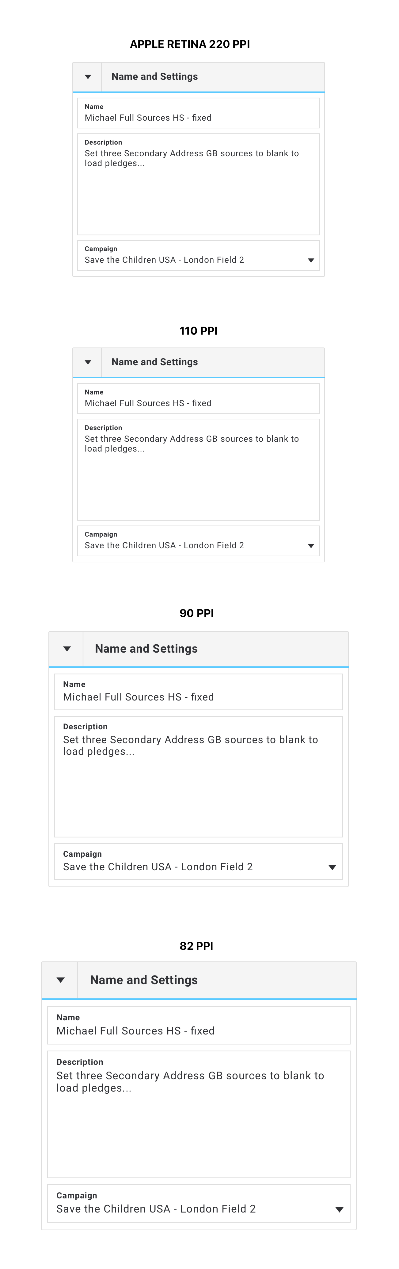
Let's get real and talk PPI
Unfortunately Google Analytics doesn't give us anything else than pixel screen resolution. Having access to PPI would be a lot more interesting as it would reflect the actual seen size of elements on users' screens. We can however extrapolate an estimate of what the PPIs might be by looking at the resolutions Google Analytics gives us and comparing them with most commonly found screen resolutions in the big brands of Desktop and Laptop computers.
1920x1080: Desktop computer, very popular with screens ranging from 22" (100 PPI) to 24" (92 PPI) and even cheap 27" (82 PPI). Recently can also be found in more high end 15.6" (141 PPI) laptops.
1366x768: Laptop computer, very popular resolution (albeit losing popularity in favor of higher density screens) in small screen sizes (13.3" / 118 PPI), 14" (112 PPI) and cheap "wide-screen" 15.6" (100 PPI) laptops (it is the cheapest way for a manufacturer to label a screen "HD").
1600x900: "Wide screen" (16:9) desktop computer, generally found on 20" (92 PPI) screens.
1280x800: Laptop computer, was common in wide-screen (13.3" / 113 PPI), 14" (108 PPI) and 15.6" (97 PPI) laptops computers until 2010.. Nowadays making a comeback on cheap tablets.
1518x853: A bit of an odd case. I suspect cheap extra wide-screen laptop computers in the 15.6" (111 PPI) range.
Bottom line is that the very large majority of our users (about 75-80%) sees a Pixel Per Inch density around 100 give or take 10 PPI. At best (110 PPI) this is pretty much exactly half the PPI seen on all Retina Apple Mac laptop and desktop hardware (about 220 PPI).
"What does this all mean ?" I hear you say. Well depending on your own screen size and resolution it means that what your eyes are seeing might not be what most of our users' eyers are seeing. Especially in terms of perceived sizes (let's not get into color profiles and contrast... ;)). How about an example?
Let's take for example users with 27" screens. Depending on the brand and model of that screen its PPI can range in between 82 PPI (most of these screens) to 218 PPI (rare high end, iMac Retina 5K) with some around 110 PPI (like myself and James for example).
We can leave Apple Retina screens on the side as they are conceived to double the amount of pixels and therefor won't impact the perceived sized.
Apple Retina screens aren't a problem. A 200px square will have exactly the same perceived size on a 27" 110 PPI screen and on a Apple Retina 27" 220 PPI screen.
Things are a little trickier with differences in between a 82 PPI 27" and a 110 PPI. A picture speaks a thousand words so see below for a comparison of size as seen in the eyes of our user.
This isn't always easy to assess and maybe a useful trick is to look at mainstream designs (Facebook, Gmail etc.) and compare them side by side with the design you are trying to work out. Of course make sure that your browser is showing you the 100% scale (hit command + 0).
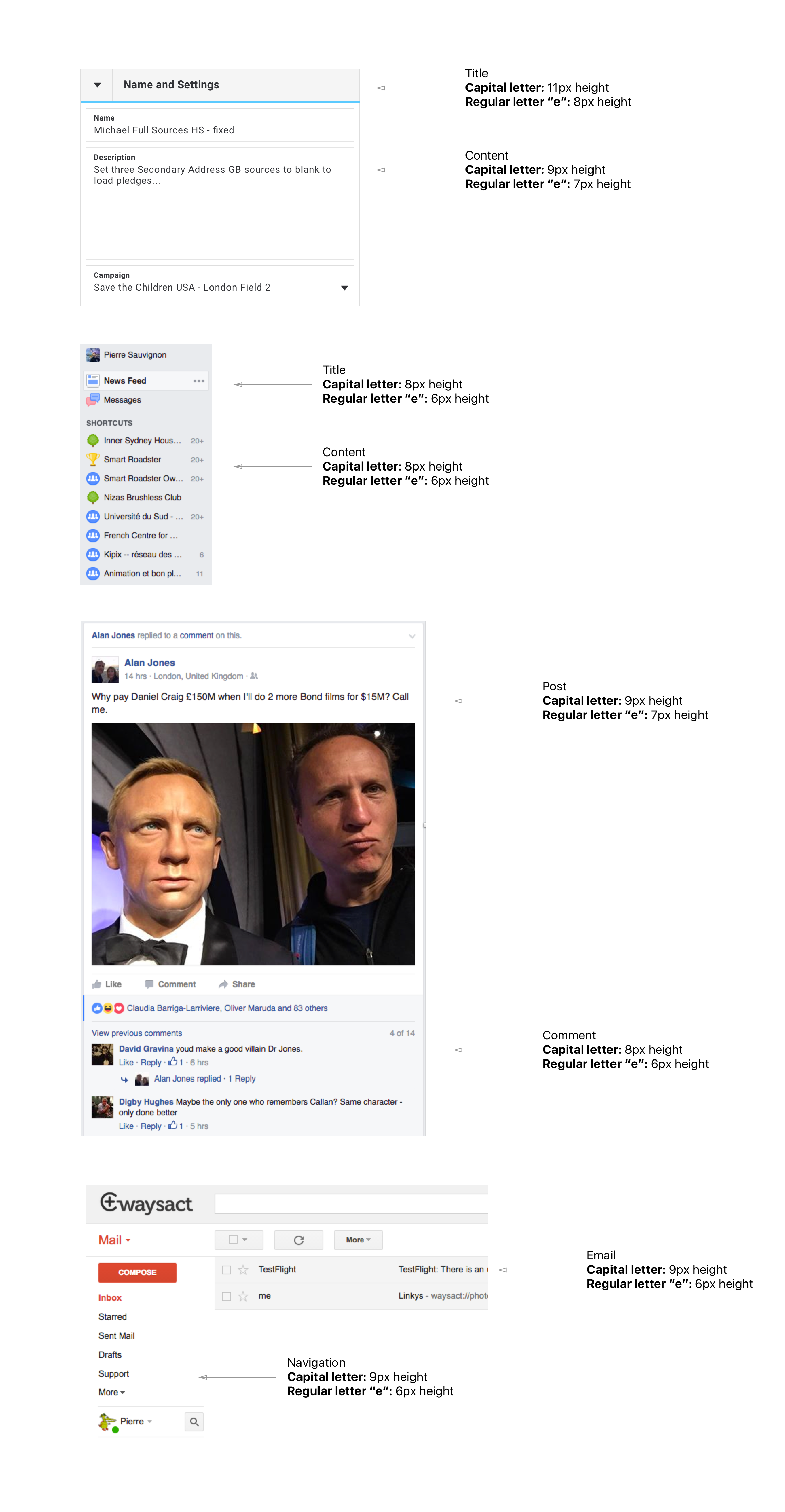
In the two examples used above (Facebook and Google Mail) the font sizes that we find on these widely used web services are one level smaller that our current choice of font sizes in the Pledge Edit fields.
It's a windows world
The vast majority of our users is using a Microsoft Windows operating system. This is to be expected in our industry. The good news though is that modern browsers are widely used, especially Google Chrome.
Feature complexity
Our users have business processes specific to their companies. Our customer acquisition strategy meant that we would tweak our app to accommodate their requirements which led to a very feature deep application with many features relevant to some but not all.
This has a direct impact on how we design this app. When we add a component, feature, block... we have to ask ourselves, how would the page look and function without this element? This is because on some accounts it is likely that this element won't be displayed due to different customer requirements. Long story short our design has to be very flexible, almost at a granular level (form fields, table rows...) and expect to be expanded / collapsed based on more or less obscure requirements (obscure in the sense that we, designer & developers, might not be aware of the said requirements). This is particularly hard to test due to the randomness of the requirements and can only function well if this is a core concern at the design stage.
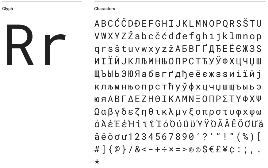
Typography
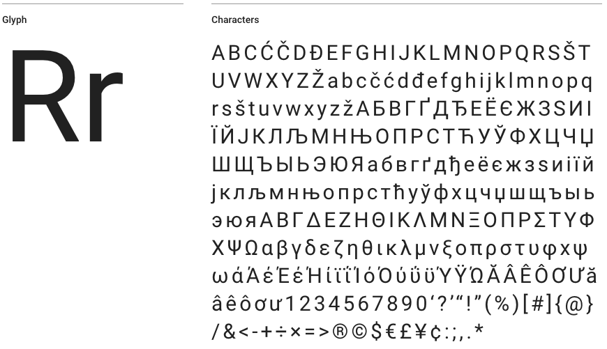
Throughout the app we use the Roboto font by Christian Robertson (Apache License 2.0, available via Google Fonts).
Fonts are like wines, they are pretty hard to describe. Christian described his font as follow:
"Roboto has a dual nature. It has a mechanical skeleton and the forms are largely geometric. At the same time, the font features friendly and open curves. While some grotesques distort their letter-forms to force a rigid rhythm, Roboto doesn't compromise, allowing letters to be settled into their natural width. This makes for a more natural reading rhythm more commonly found in humanist and serif types." Amen to that.
We have 3 of the Roboto font weight available, Light (300), Regular (400) and Bold (700). Why only 3 I hear you say? Well because that's all we should ever need and also because the more fonts we start loading on our pages the heavier and slower they get.
This is what it looks like:
Light 300
Apparently we had reached a great height in the atmosphere, for the sky was a dead black, and the stars had ceased to twinkle. By the same illusion which lifts the horizon of the sea to the level of the spectator on a hillside, the sable cloud beneath was dished out, and the car seemed to float in the middle of an immense dark sphere, whose upper half was strewn with silver. Looking down into the dark gulf below, I could see a ruddy light streaming through a rift in the clouds.
Regular 400
Apparently we had reached a great height in the atmosphere, for the sky was a dead black, and the stars had ceased to twinkle. By the same illusion which lifts the horizon of the sea to the level of the spectator on a hillside, the sable cloud beneath was dished out, and the car seemed to float in the middle of an immense dark sphere, whose upper half was strewn with silver. Looking down into the dark gulf below, I could see a ruddy light streaming through a rift in the clouds.
Bold 700
Apparently we had reached a great height in the atmosphere, for the sky was a dead black, and the stars had ceased to twinkle. By the same illusion which lifts the horizon of the sea to the level of the spectator on a hillside, the sable cloud beneath was dished out, and the car seemed to float in the middle of an immense dark sphere, whose upper half was strewn with silver. Looking down into the dark gulf below, I could see a ruddy light streaming through a rift in the clouds.In some cases we can find ourselves needing a more precise font especially when it comes to glyphs readability. For example in the the Pledge Edit page (field's content) That's where Roboto Mono comes into play (Apache License 2.0, available via Google Fonts).
Christian's words: Special consideration is given to glyphs important for reading and writing software source code. Letters with similar shapes are easy to tell apart. Digit ‘1’, lowercase ‘l’ and capital ‘I’ are easily differentiated as are zero and the letter ‘O’. Punctuation important for code has also been considered. For example, the curly braces ‘{ }’ have exaggerated points to clearly differentiate them from parenthesis ‘( )’ and braces ‘[ ]’. Periods and commas are also exaggerated to identify them more quickly. The scale and weight of symbols commonly used as operators have also been optimized.
This is what it looks like:
Light 300
Apparently we had reached a great height in the atmosphere, for the sky was a dead black, and the stars had ceased to twinkle. By the same illusion which lifts the horizon of the sea to the level of the spectator on a hillside, the sable cloud beneath was dished out, and the car seemed to float in the middle of an immense dark sphere, whose upper half was strewn with silver. Looking down into the dark gulf below, I could see a ruddy light streaming through a rift in the clouds.
Regular 400
Apparently we had reached a great height in the atmosphere, for the sky was a dead black, and the stars had ceased to twinkle. By the same illusion which lifts the horizon of the sea to the level of the spectator on a hillside, the sable cloud beneath was dished out, and the car seemed to float in the middle of an immense dark sphere, whose upper half was strewn with silver. Looking down into the dark gulf below, I could see a ruddy light streaming through a rift in the clouds.
Medium 500
Apparently we had reached a great height in the atmosphere, for the sky was a dead black, and the stars had ceased to twinkle. By the same illusion which lifts the horizon of the sea to the level of the spectator on a hillside, the sable cloud beneath was dished out, and the car seemed to float in the middle of an immense dark sphere, whose upper half was strewn with silver. Looking down into the dark gulf below, I could see a ruddy light streaming through a rift in the clouds.Subpixel Rendering
The Problem
There are many different ways to render fonts. Depending on OS, Browsers and even screens, different rendering methods are used.
To keep things simple let’s concentrate on subpixel rendering. Subpixel rendering generates intermediate pixels on the edges of the font’s regular pixels to smooth out the angles. It is enabled by default on modern devices / browsers.
This works well on hi-DPI screens (retina screens and other high pixel density screens) creating crisper fonts. However as the pixel density decreases a blurriness is introduced as the intermediate pixels get bigger and our eyes cannot be tricked anymore.
This visual issue becomes particularly obvious at extreme sizes (“light” and “bold”). So with light text on dark background where the “light” text becomes in fact quite thick on low DPI screens and bold text on dark background where bold gets and extra layer of boldness and becomes blurry.
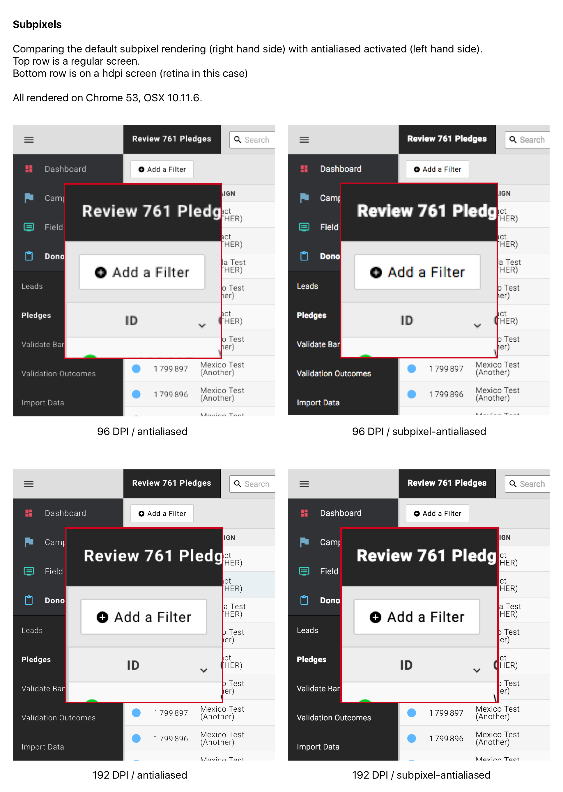
As mentioned earlier the issue’s amplitude can vary depending on browser, OS etc. Chrome seems to be particularly bad at it with added boldness / blur all around.
Obviously the font choice as an impact on this too. Some fonts are more or less prone to this issue depending on their original design.
A Solution
Disable sub-pixel rendering on low DPI screens.
Something in the lines of:
@media only screen and (-webkit-max-device-pixel-ratio: 1.5),
                 only screen and (-o-max-device-pixel-ratio: '150/100'),
                 only screen and (max-resolution: 96dpi),
                 only screen and (max-resolution: 1.5dppx) {
            -webkit-font-smoothing: antialiased;
          }
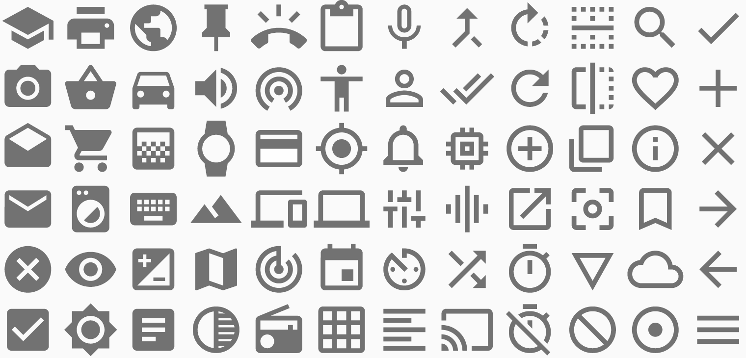
Iconography
Our icons library of choice is the Google Material Icons library by, you guessed it, Google (Apache License 2.0, available via Google or Git Repository).
Just like with fonts and wines (and Pokemon), icons styles are pretty hard to describe. This is how the Google Design team puts it:
"We challenged ourselves to create a visual language for our users that synthesizes the classic principles of good design with the innovation and possibility of technology and science. This is material design." Whoopdeedoo.
Color Palette
UI colors
Our UI colors are dark toned to let the emphasis be on the actual content of the page and allow contrasted iconographic elements to stand out for an easy identification of the various actionable parts of the interface.
Top Level pages
Each of our top level pages as a dominant color. It is shown in the icon representing the page in the side navigation bar and re-used subtlety in inner elements of the page's body.
Aliens
Our little aliens (formerly known as "monsters") are Danielle's creation. They roam around the app bringing in colors and delight. Their purpose is to break up the monotony of work tasks and business processes by surprising, informing and sometimes just helping by being there.
Aliens are quirky design elements meant to delight our users and break-up monotonous tasks.
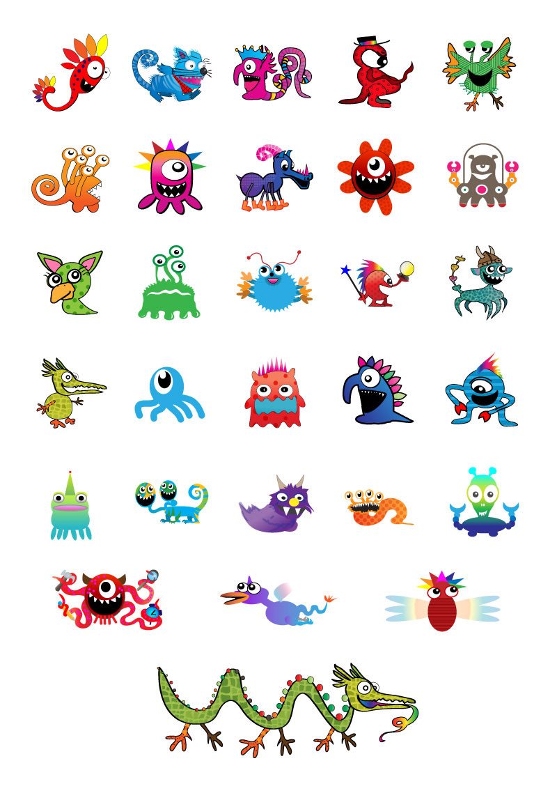
Most of the aliens came to existence as employees avatars. However you'll also find free roaming aliens who just exist well... because they can.
Dowload all Aliens
All aliens can be found in this SVG master file: Aliens_Master.svg.
Navigation
Historically our navigation used to be horizontal at the top of the page. This became quickly an issue as we saw the number of top level pages increase and were limited by the available horizontal space. It was also eating up on the available vertical space (through 2 lines of content with the top and secondary level of navigation items) which, with the trend of screens getting wider (and not higher) also started to be problematic.
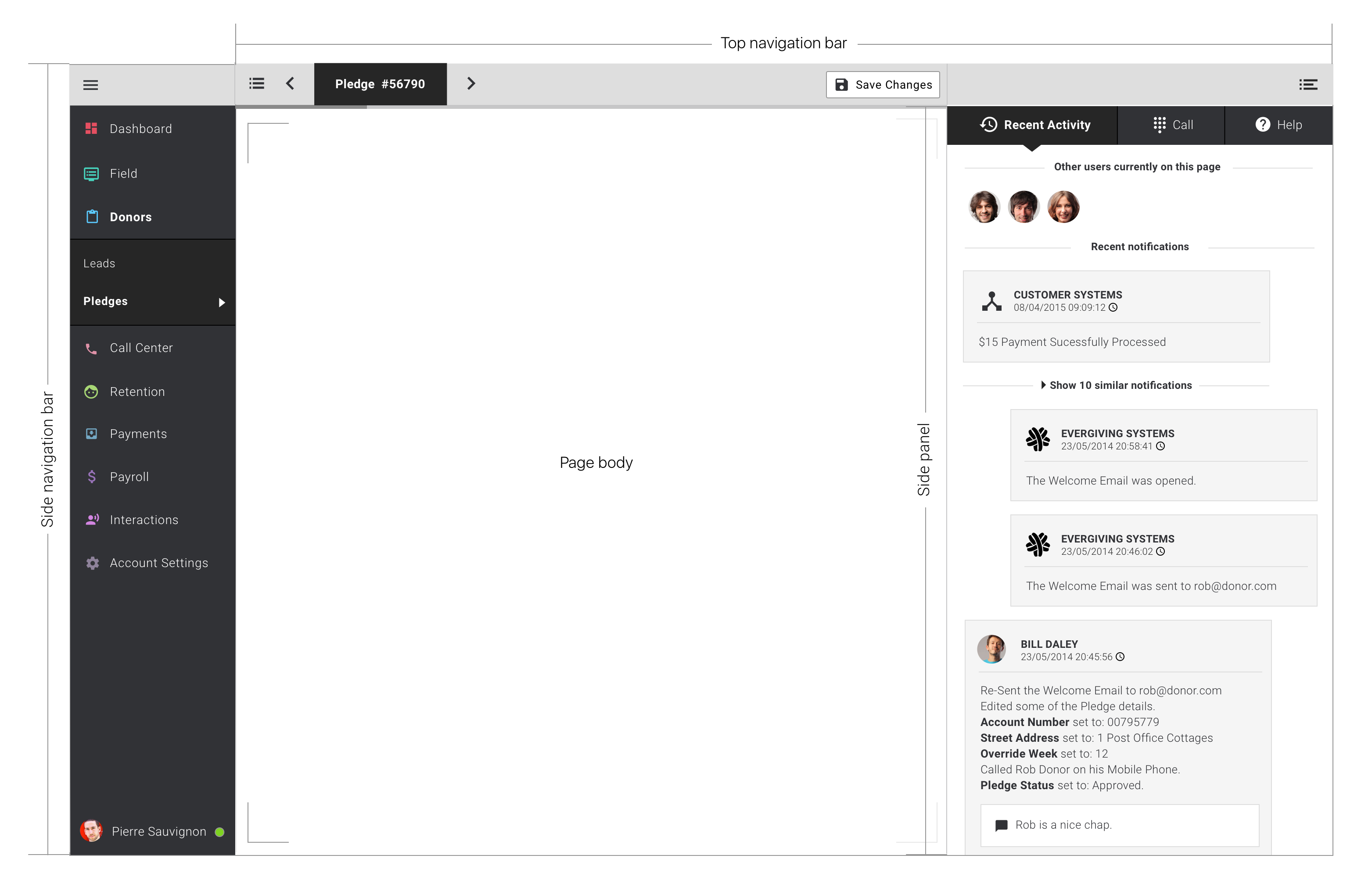
Hence the move to a vertical, left hand side, navigation bar. This setup gives us the maximum possible space for actual content of the page (referred to as "Page body" in the screen below). Complementary to the left hand side navigation bar we also have a top navigation bar. We will now look into details of these 2 main navigation elements.
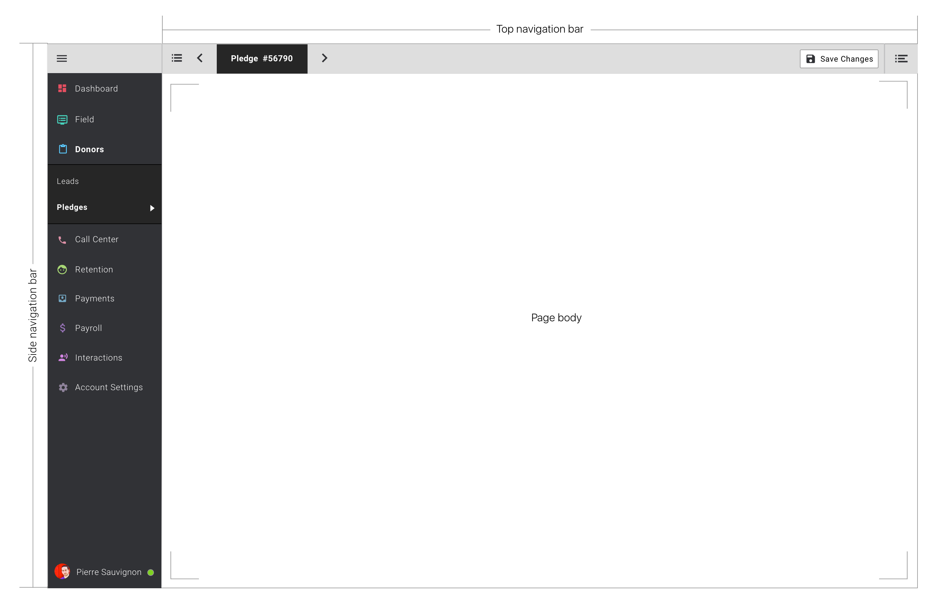
Side Navigation Bar
User Story
As a Back-end User I would like to find entry points to each of the main parts of the application so that I can navigate there and know where I am.
This is on every inner page of the application. The user experience should be constant throughout the application. Each top level page is identified by an icon (colored with the dominant color of this page) and a label. When the line is clicked a panel with the sub-level pages slides down (when sub pages are available) and the user is taken to the landing page of this section (if applicable).
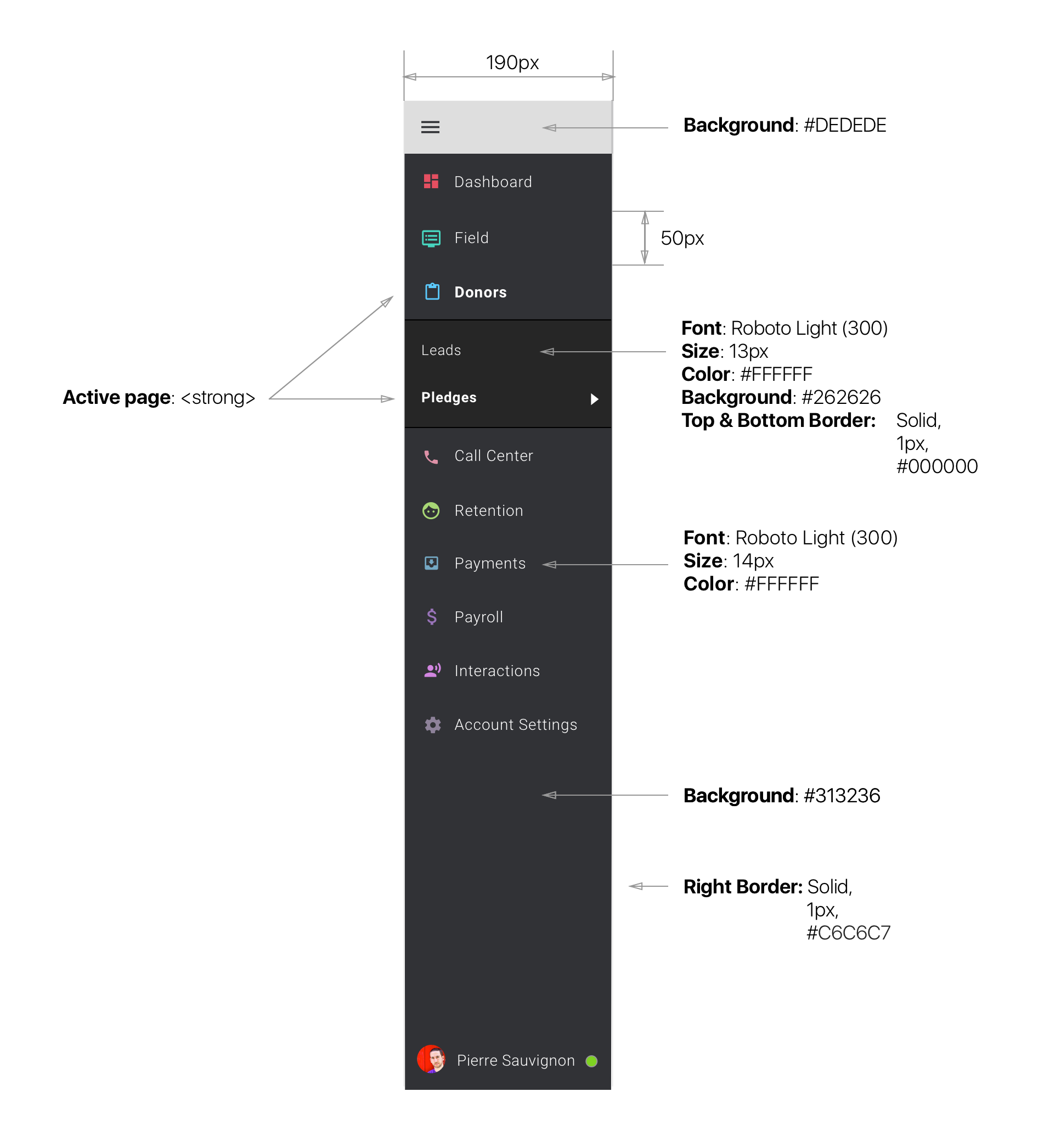
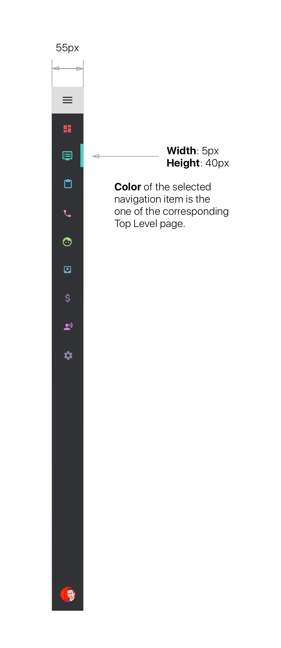
The Side Navigation bar can be collapsed at any time by clicking the top grey are with the burger menu icon. This icon acts as a toggle and switch between the two status of our side bar (collapsed / expanded). The side bar also automatically goes into collapsed mode when the horizontal browser window size is less than or equal to 1024px. Clicking anywhere in the collapsed version of the menu triggers its expansion. Clicking outside the side navigation area on a browser window size less than or equal to 1024px triggers the re-collapse of the side navigation.
In its collapsed status, the side navigation indicates the current active page by showing a colored bar on the right hand side of the active section's icon. This bar is colored in the color of its active page.
When collapsed the Navigation bar only shows the top level sections. Sub-items are only visible when the Navigation bar is in its expended status. So in order to access a sub-element, our user has to click anywhere in the collapsed menu which expands the bar and reveal sub navigation items.
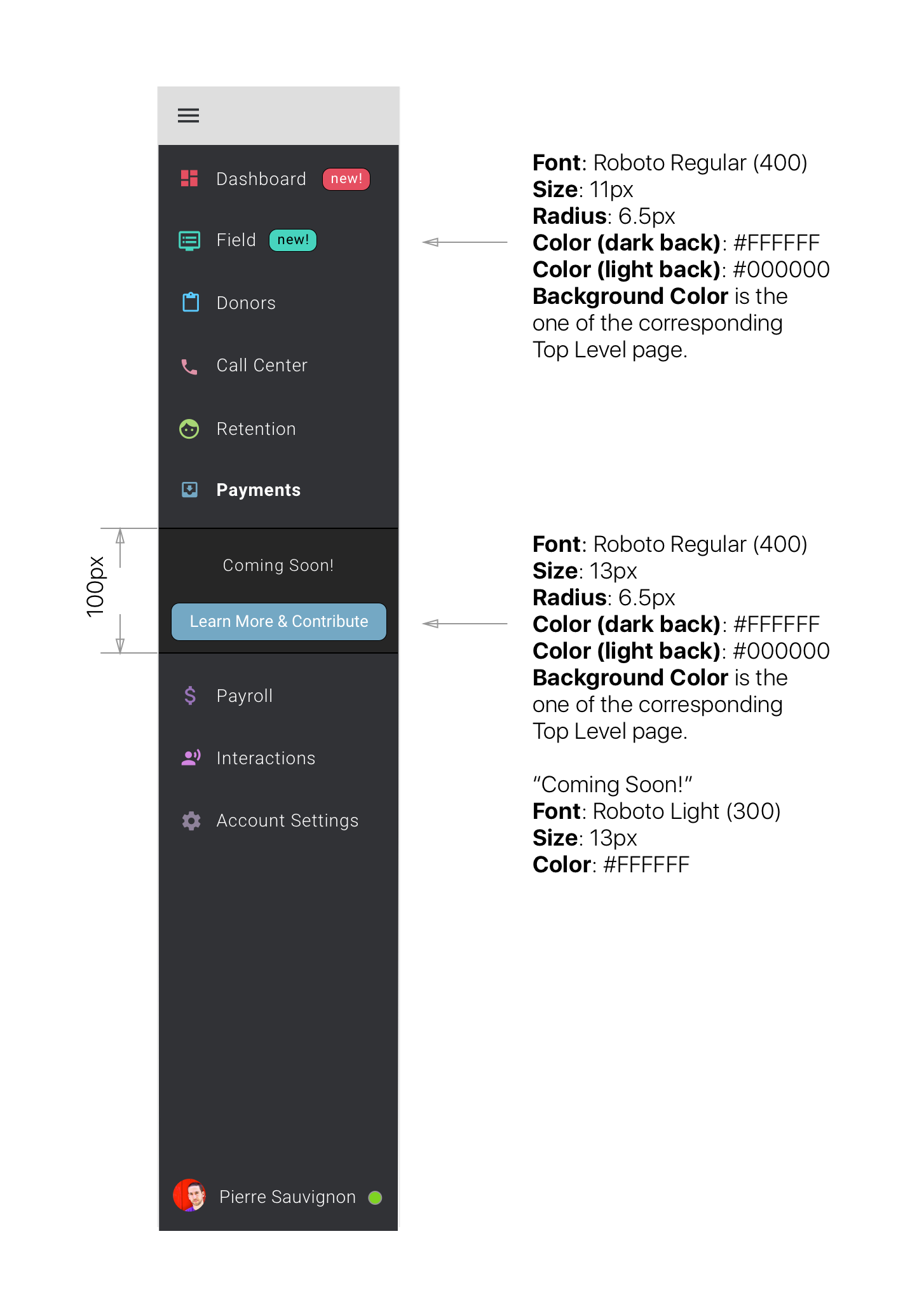
Highlighting new navigation elements
User Story
As a Back-end User I would like to be given visual clues of new content or upcoming content so that I can give them my attention.
Top Navigation Bar
User Story
As a Back-end User I would like to find actionable items relevant to the active page in a designated area so that I easily find my desired features on the page.
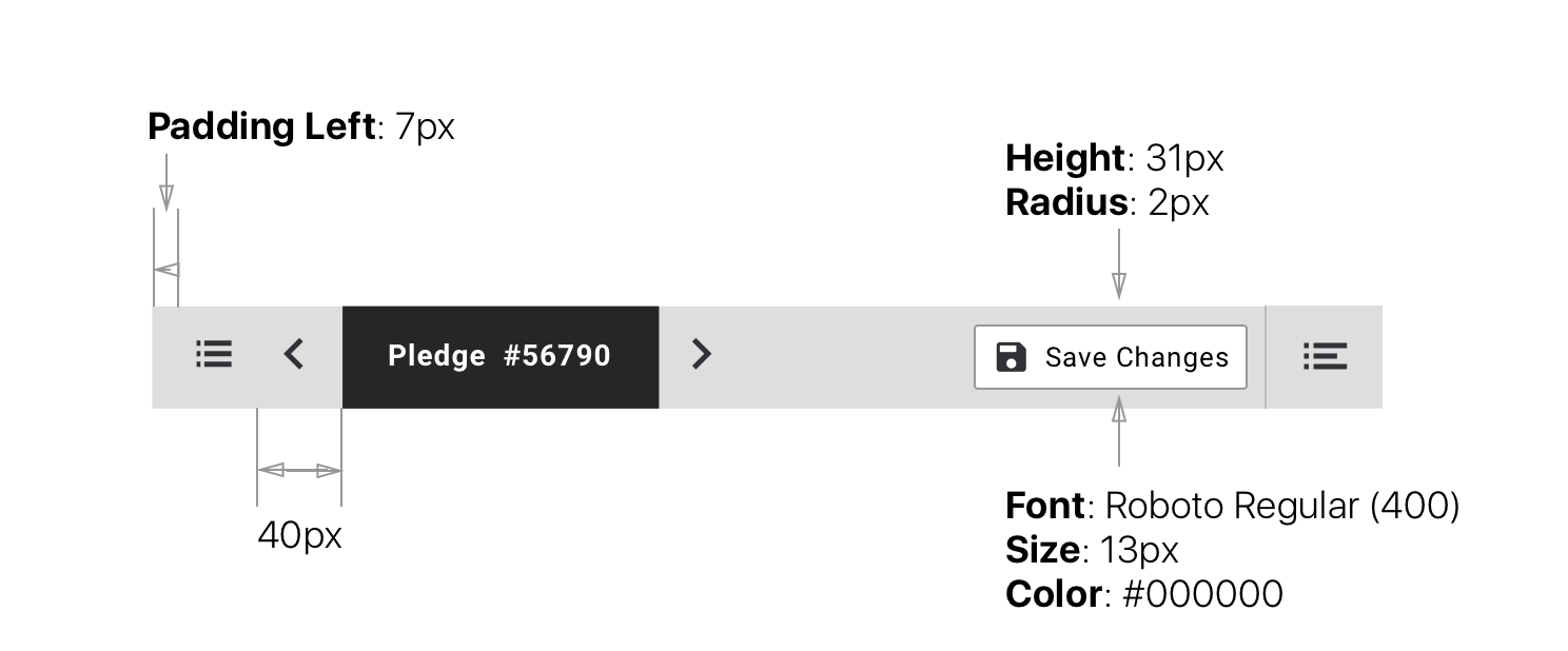
The page title (when relevant) can be boxed within a #262626 rectangle. The button actioning the right hand side panels is isolated with a left hand side border of 2px and colored #C6C6C7.
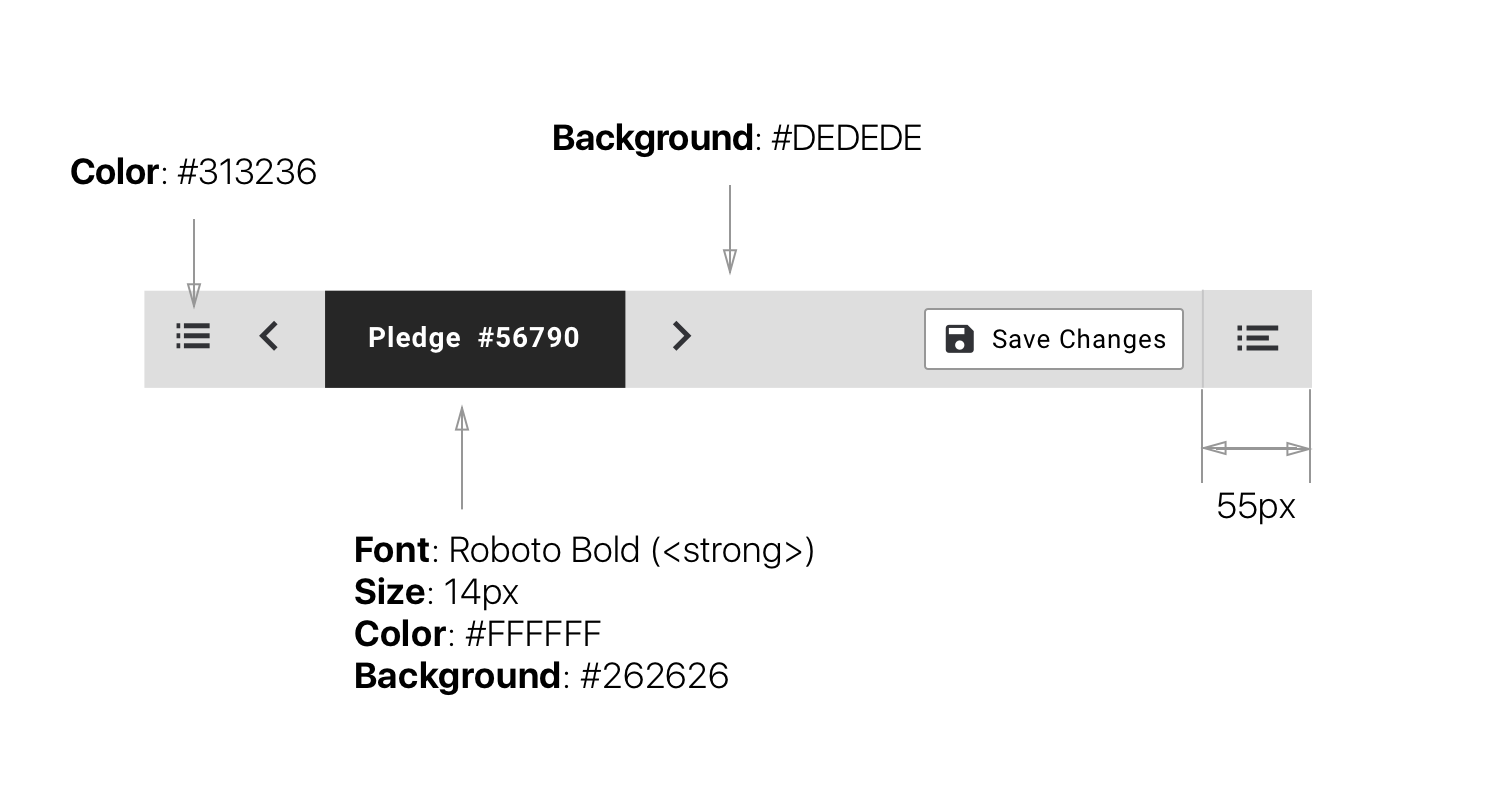
Icons of the Top Navigation sit within a 40px wide box. When required we have a floating action button. This type of button must be used for a singular action that is decisive to the page (typically "Save").
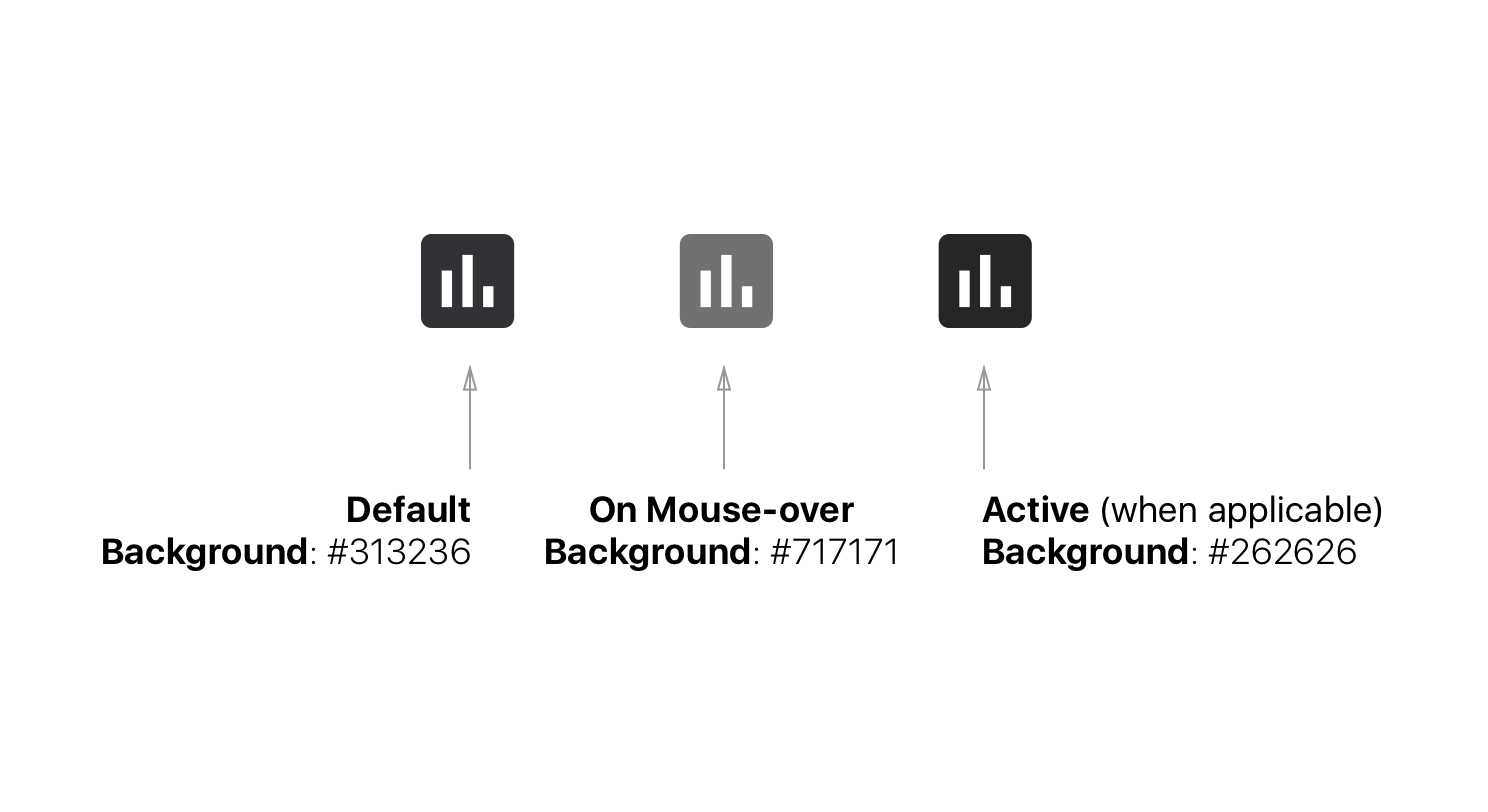
Icons of the Top Navigation have a mouse-over state that changes their color to #717171.
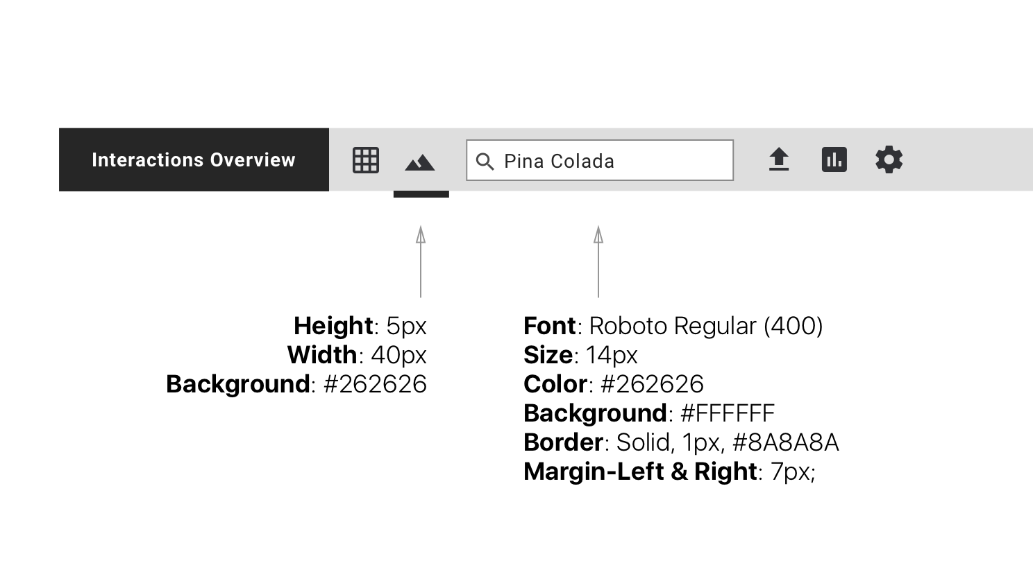
Some pages require richer content in the top navigation bar. So on some cases we might find a search bar and we might also need to identify which of the icons are currently selected (ie. impacting the view). Selected icons are identified by an underline. In this example they are used to change the page view from table to map and vice versa.
Side Panels
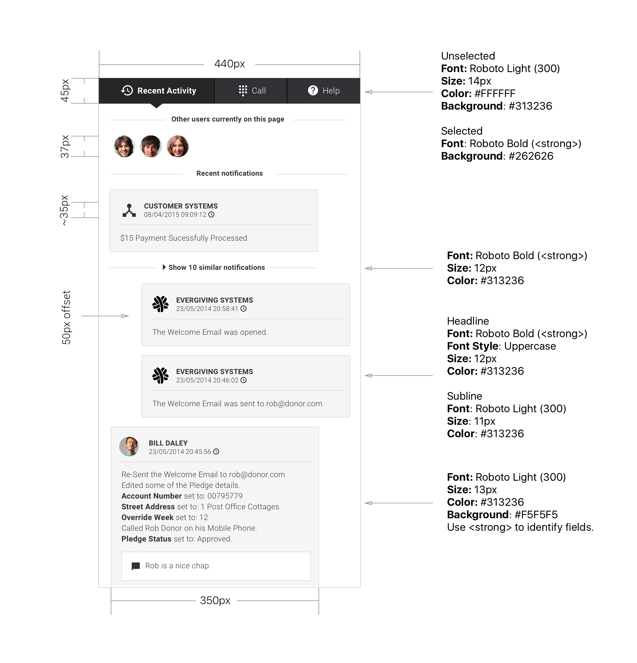
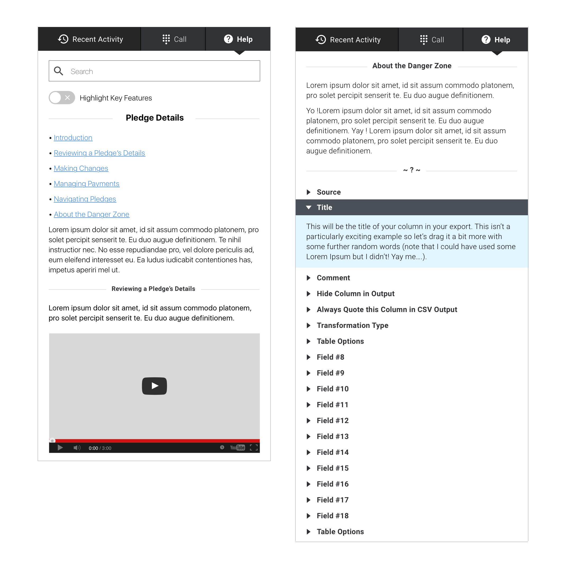
To accommodate some of the new features that made it in as part of our overall redesign we've integrated a new block of elements that is known as the "Side Panel". Currently it hosts 3 panels; The "Recent Activity", the "Call" widget and the "Help" section. We will look at details of each panel in the sub parts below.
Interactive Demo
You can interact with the Side Panels in the Marvel Demo.
Recent Activity
User Story
As a Back-end User I would like to see details of what has happened on a specific page so that I can be informed of the context and be more efficient about my work. This is particularly relevant to the Pledge Edit page.
See below for details on the side panels' parts. Looking specifically at the Recent Activity panel but most of it is valid across all panels unless specified otherwise in the sections below.
Call
User Story
As a Back-end Call Center User I would like to have access to a call widget so that I can be equipped to make calls, take notes, pause calls etc. Using the side panel for this is interesting as it allows us to consistently keep the widget open while our user navigates through other pages.
The call side panel is made up of 3 distinct sections:
- The call information (who is calling, why etc.)
- The notes section (used by the call center user to record relevant info)
- The call script (when active offers a standard conversation flow relevant to the charity, type of call etc.)
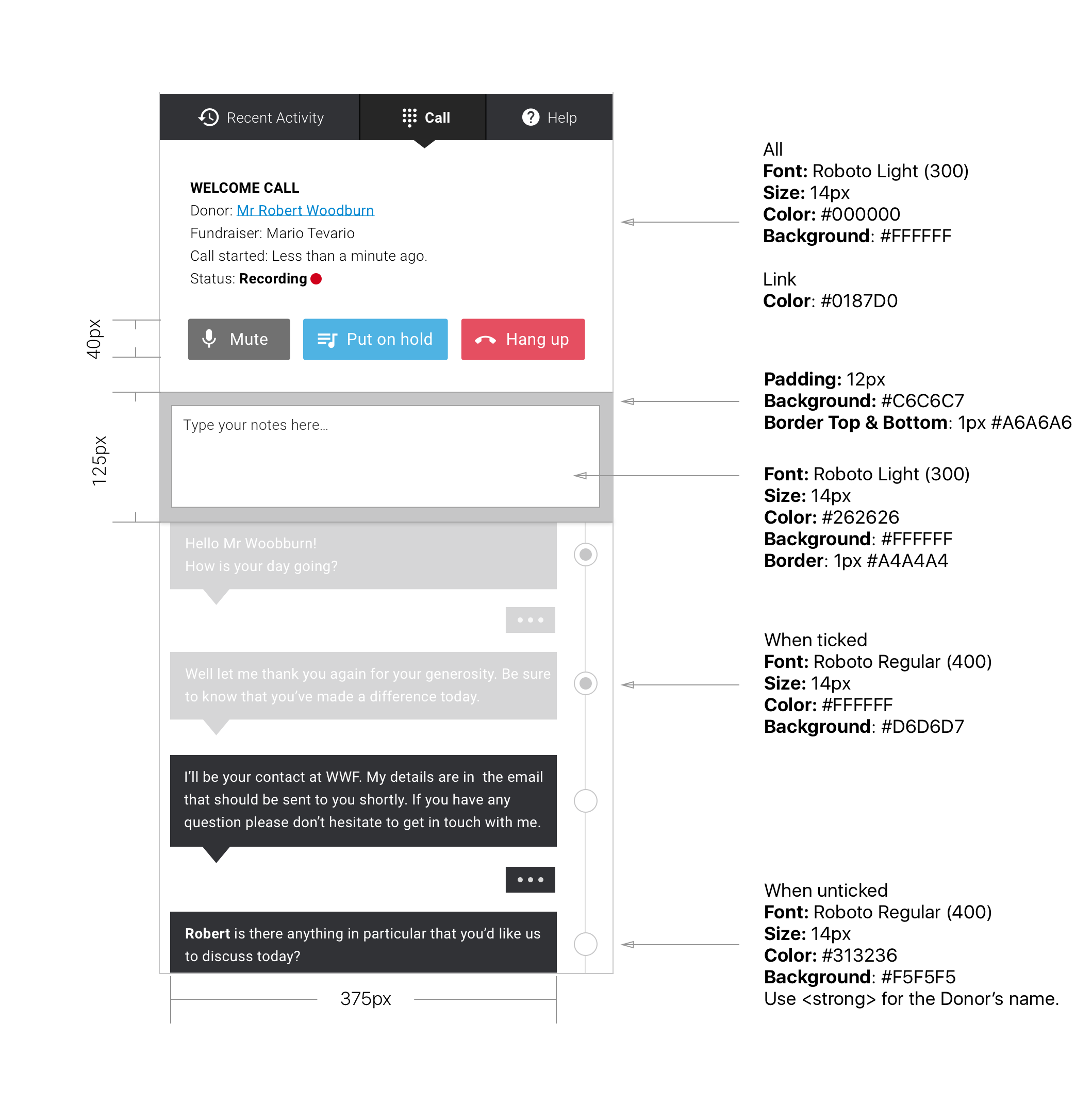
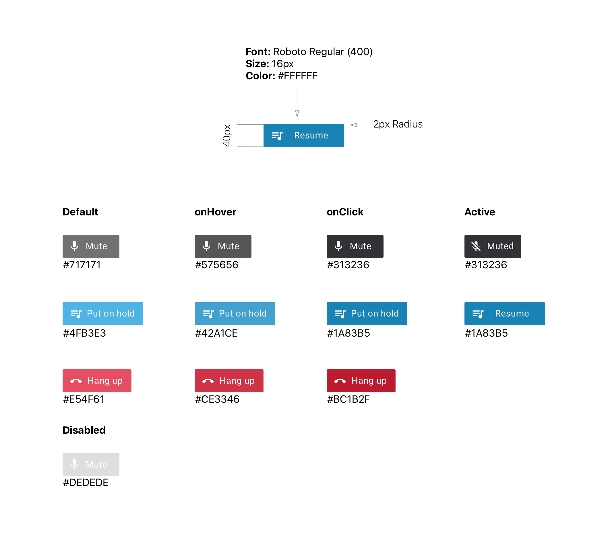
When the buttons "Mute" and "Put on hold" are clicked we display a layer on top of the bottom part of the panel (where the call script is located). This is to clearly demonstrate the status of the call which is critical on things like "Mute". Also it makes sense to have the script blocked-out when the call is muted or on hold...
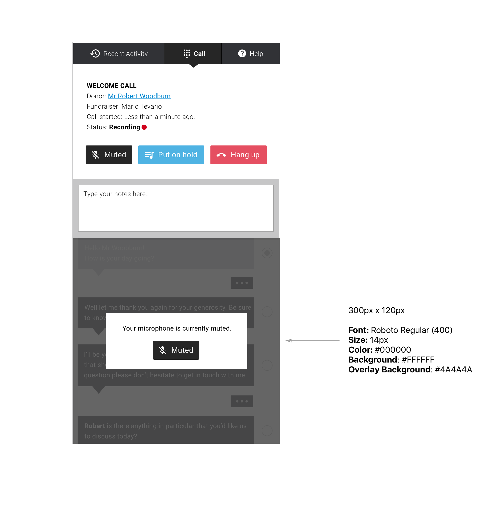
We have 3 main buttons in the call panel. I would normally be against having custom colours on a per button basis but in this case I think it was relevant to make an exception as the consequence of pressing either of these buttons are quite dramatic (nobody wants to un-mute a call by mistake, or hang up etc...). Hence... they have their own colors and follow the "floating" buttons style (2 px radius for the corners and a 40px height). The Active status is only relevant to some buttons.
Help
User Story
As a Back-end User I would like to have access to help and guidances relevant to the page I'm on so that I can use its features accurately. Here again it is interesting to use the side panel as it allow to display both the help content and its relevant page on the screen saving our user from back and forth navigation in between browser tabs.
The right hand side panel defaults to being the Help section of our app. Upon calling in the panel our user is shown relevant help for the active page. To enhance the interaction level we've added the "Highlight Key Features" and "Show me" functionalities. Our design here follows the canons instated previously.
Filters & Scopes
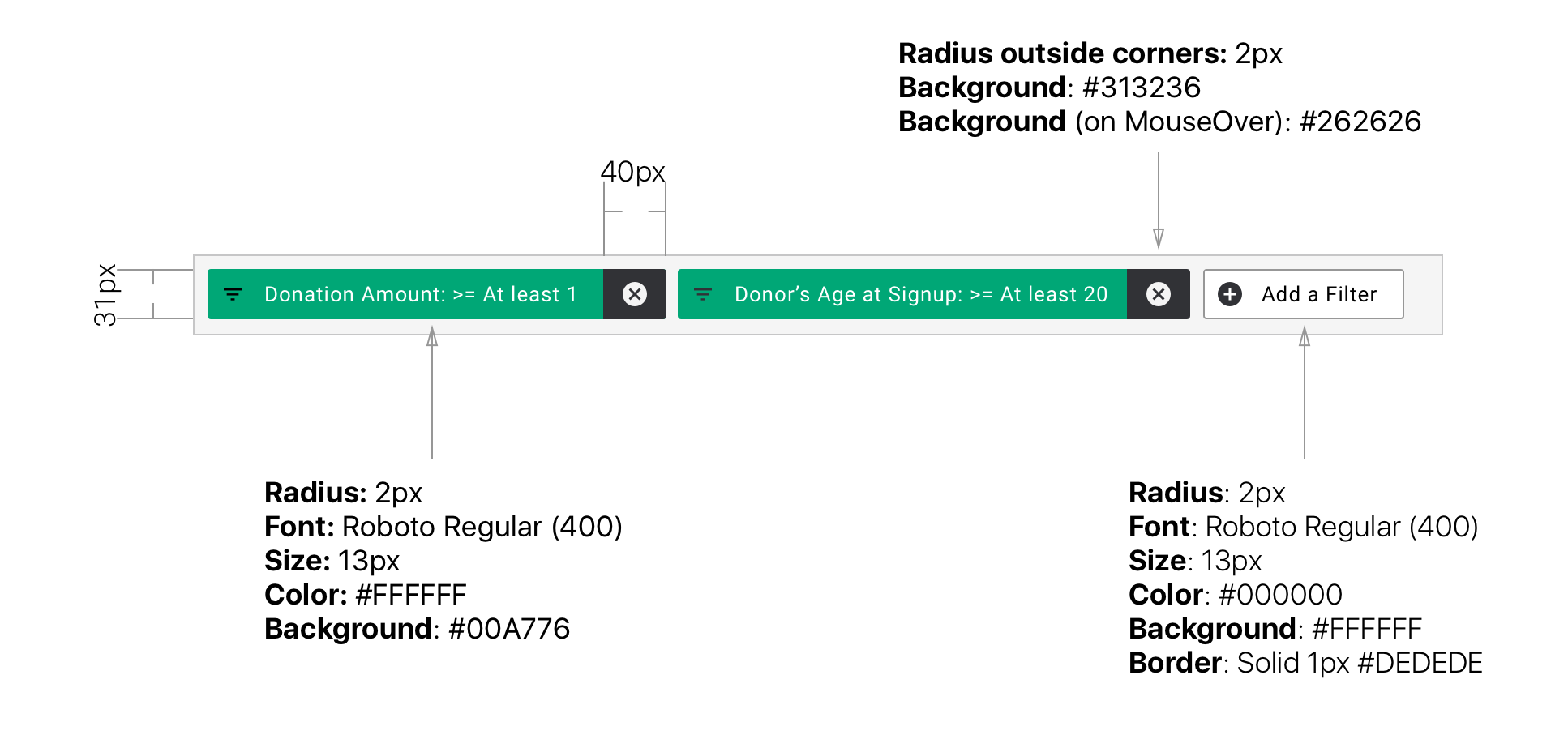
Filters
User Story
As a Back-end User processing large tables of data I would like to filter the content of my tables so that I can get to the data relevant to me.
Filters are a great tool for our users to articulate complex requirements and display the relevant data. We had to come up with a way to achieve this that would cope with the complexity of some Filters and yet offer a clean and simple UI to manage the Filters.
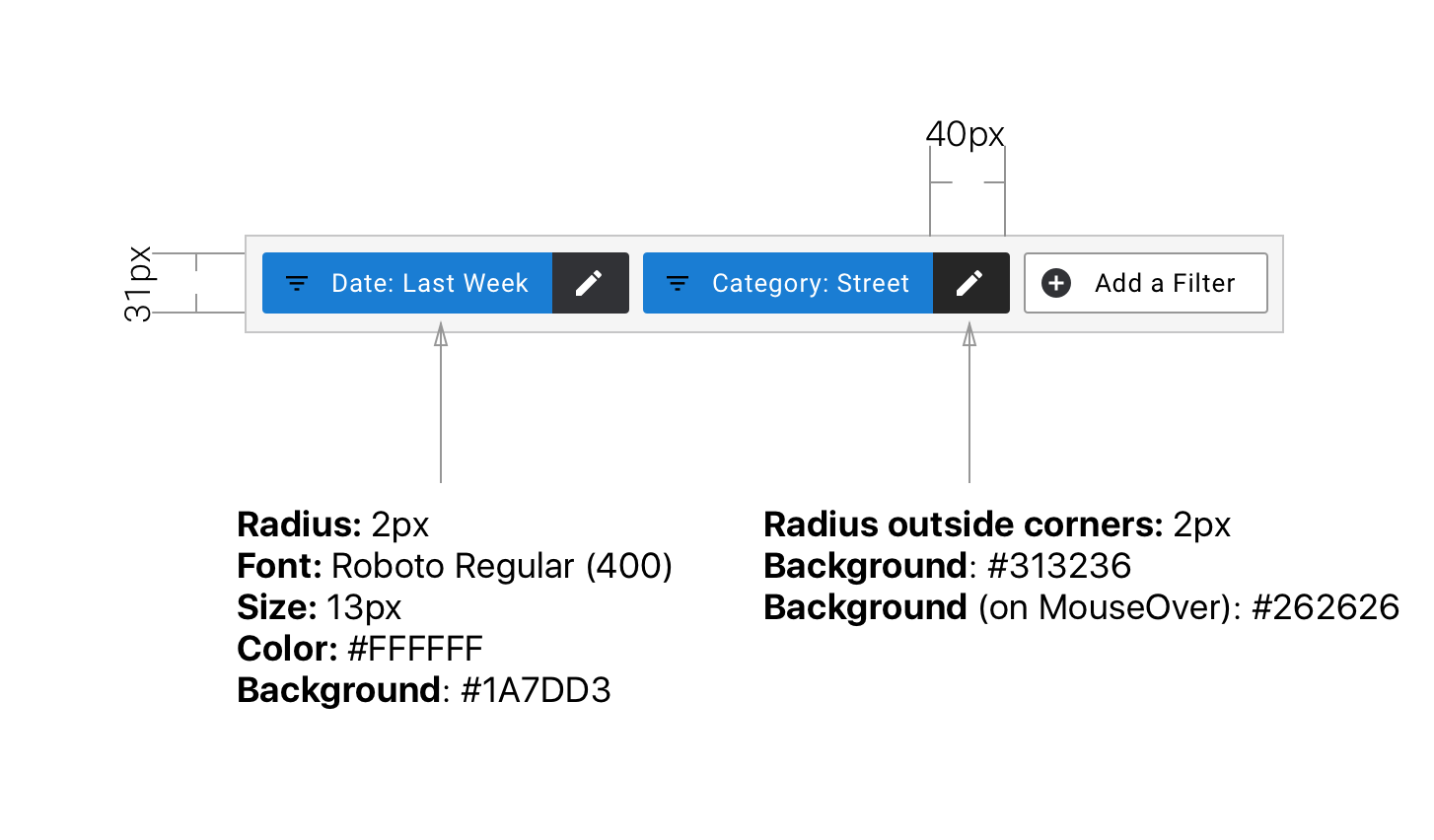
Scopes
User Story
As a Back-end User I want to be presented with quick ways to filter my data using the most common filters relevant to the page I'm on.
The scopes are filters too (yes!). The main difference is that they are permanently displayed. ie. They are by default on the screen. For our users to quickly tell the difference, Scopes are shown with a different background color than regular Filters. Scopes can't be deleted but ban be edited.
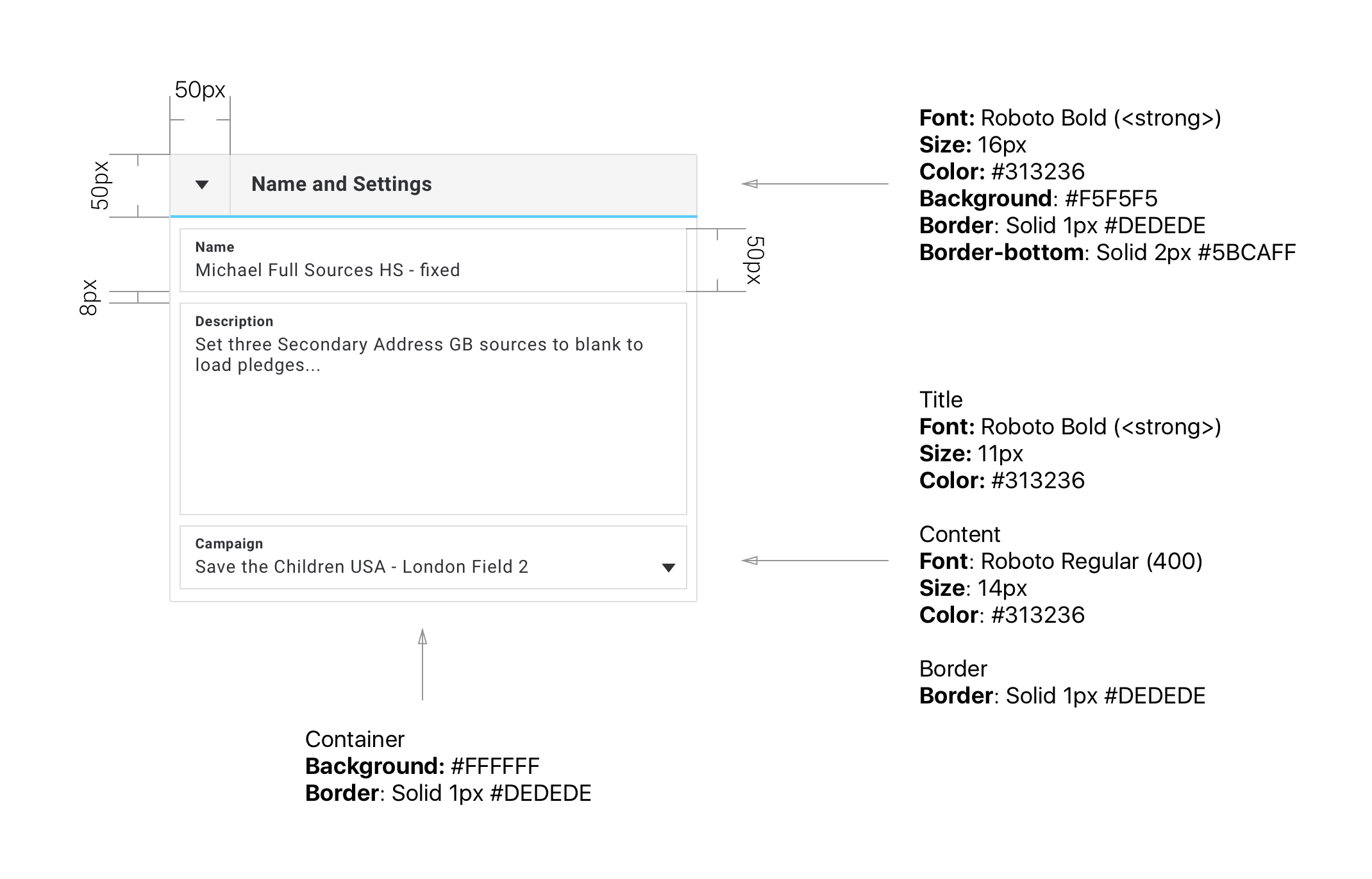
Forms
Forms are at the core of our application with the Pledge Details view. On the Pledge Details view and on some other pages we often have very large numbers of fields required to be displayed. In order to maximize space efficiency and offer a good readability the fields have their title displayed on top of the actual value field.
When relevant, the container of our fields can be collapsed. This is then shown using the Arrow icon pointing either to the right (collapsed) or down (opened).
The dominant color of the active section is used to underline the field container's header. In the example below we see the #5BCAFF blue color of the Donors' section.
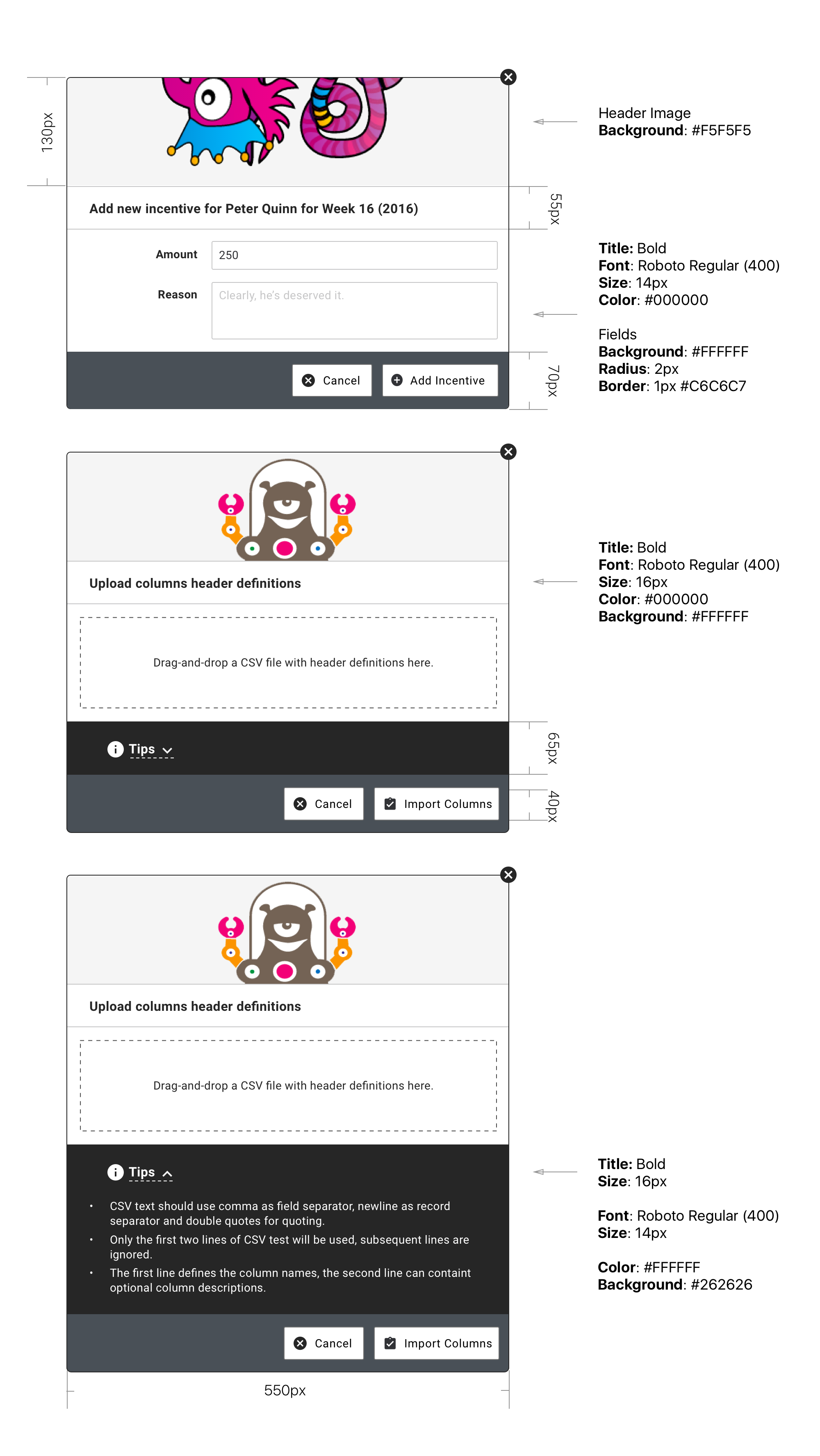
Lightboxes
Lightboxes are useful when we require some sort of brief input from our user and we cannot justify a dedicated page (because there is simply not enough input required) and/or the context dictates that it is more relevant to keep our user on the original page and bring up a lightbox.
Our lightboxes (and same goes for Alerts) are displayed over the page and see the page's content behind an overlay. This is done so as to clearly bring our user's focus on the lightbox.
In some cases we may want to display additional info text to help our user with the content. Space being precious this additional content can be hidden / revealed as our user sees fit. It is shown under the "Tips" block.
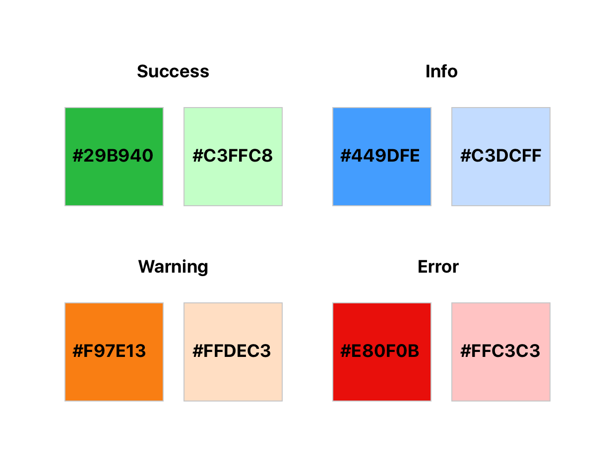
Alert Lightboxes & Notification Bars
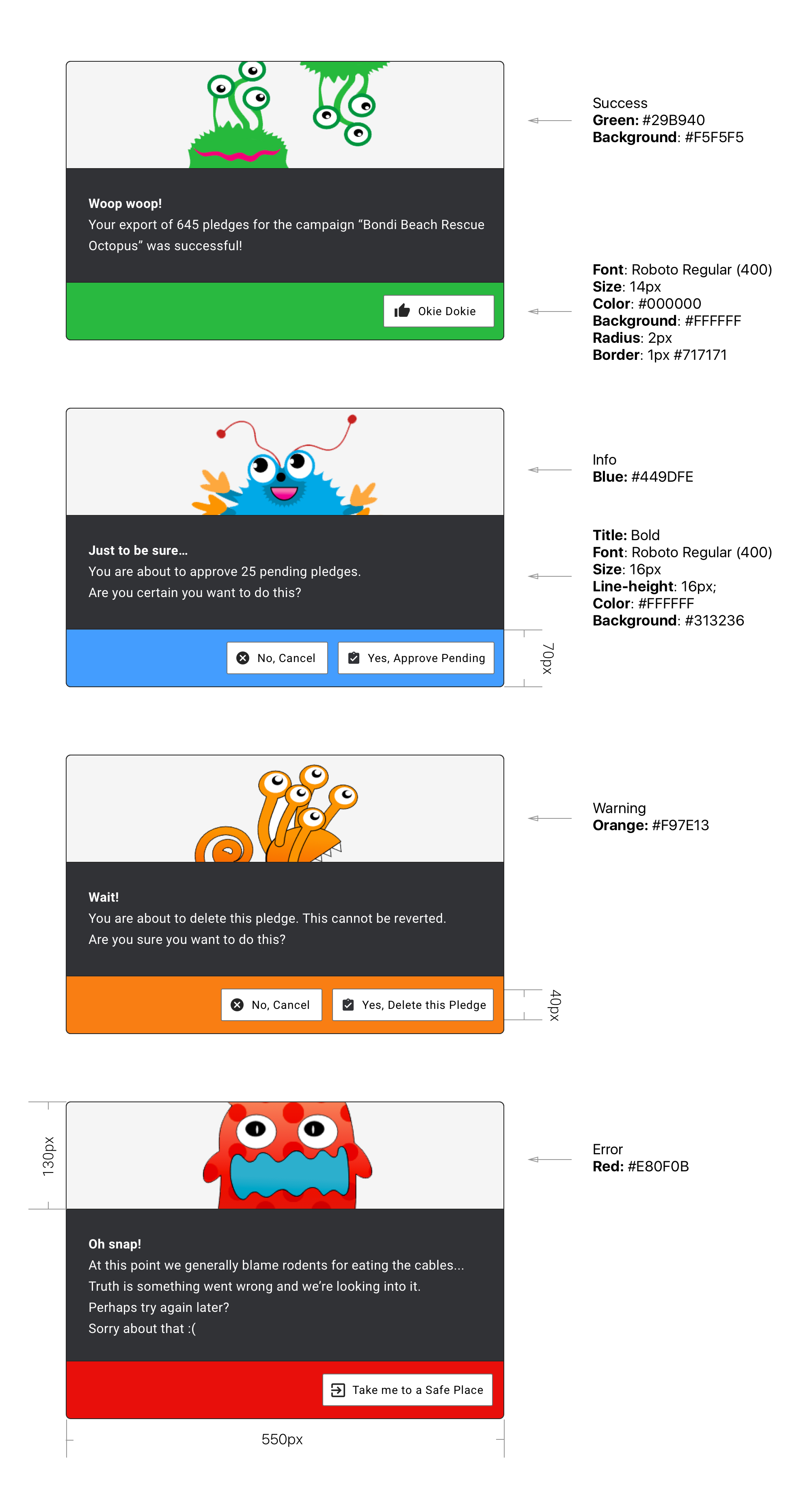
Following the Bootstrap model we have 4 different levels of alert: Success, Info, Warning, Error. Each level is delivered with slightly different features as to be most relevant to the user experience. We also have 2 options when it comes to displaying an Alert / Notification. The first option is to use a notification bar at the top of the page. The second option is to use an alert lightbox. That second option is recommended when the alert is critical to the business process. For example when a user is about to delete something important or leave a page with unsaved changes...
Notification Colors
Each notification level has a different color scheme. Each color scheme has a strong and weak color. Typically this is used to paint the background with the weaker color and use the stronger one for iconography over the background.
Notification Bars
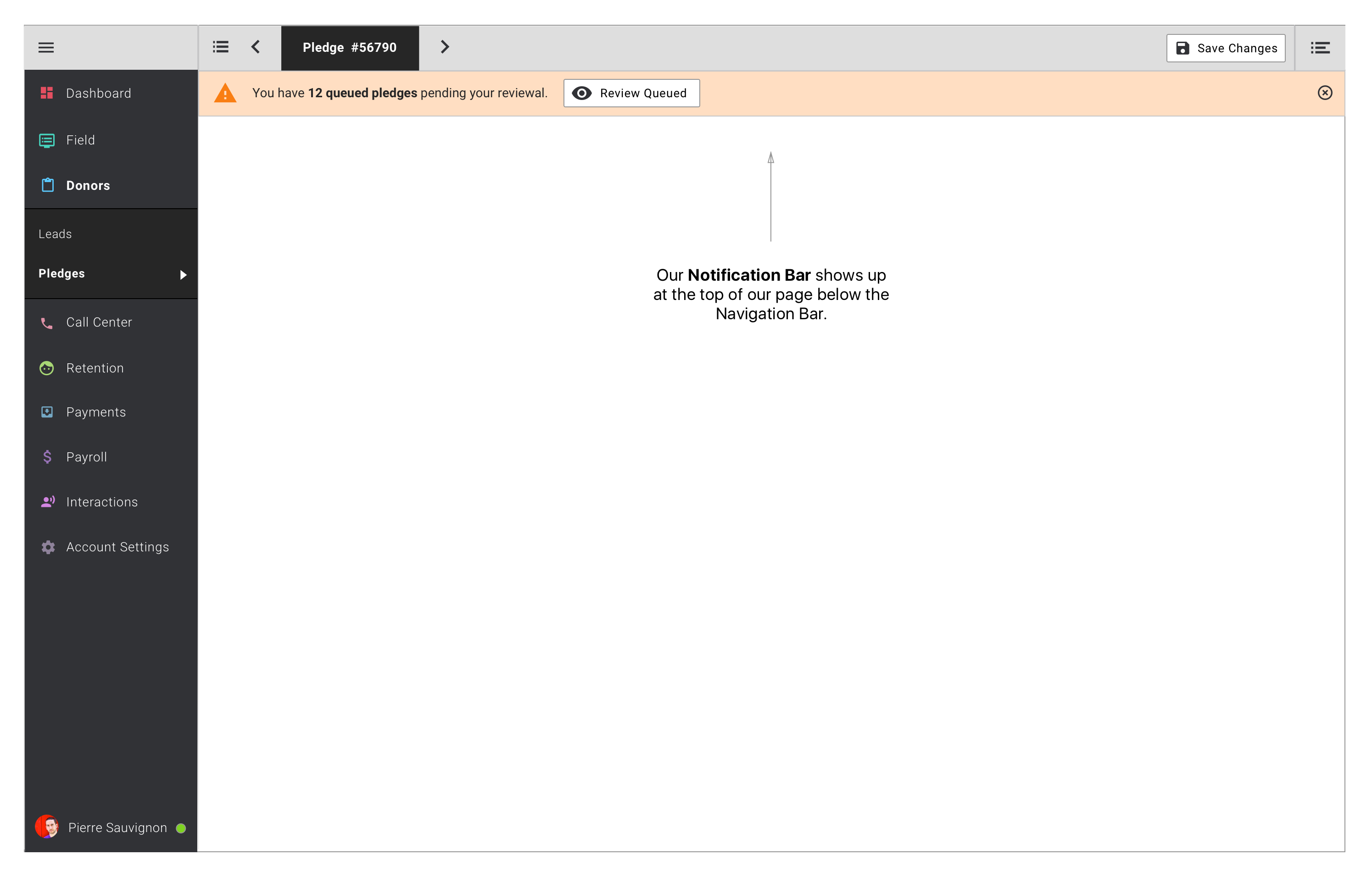
Notification bars are generally reflective of system's actions (as opposed to user's actions). For example a whole bunch of pledges were imported and processed by our systems and some require manual review from our user. Here we can use a notification bar to get our user's attention.
Depending on the degree of importance the notification bars get a slightly different treatment.
Success: Will fade out after a couple of seconds and/or our user can close it.
Info: Our user can close it. Will be displayed again if the page is reloaded and this info is still relevant.
Warning: Our user can close it. Will be displayed again if the page is reloaded and this warning is still relevant.
Error: Cannot be closed. Will only disappear if the error is fixed.
Notification bars can contain an actionable button. This is generally relevant to the Warning level and provides a short-cut to deal with the warning (ie. "Review Queued Pledges").
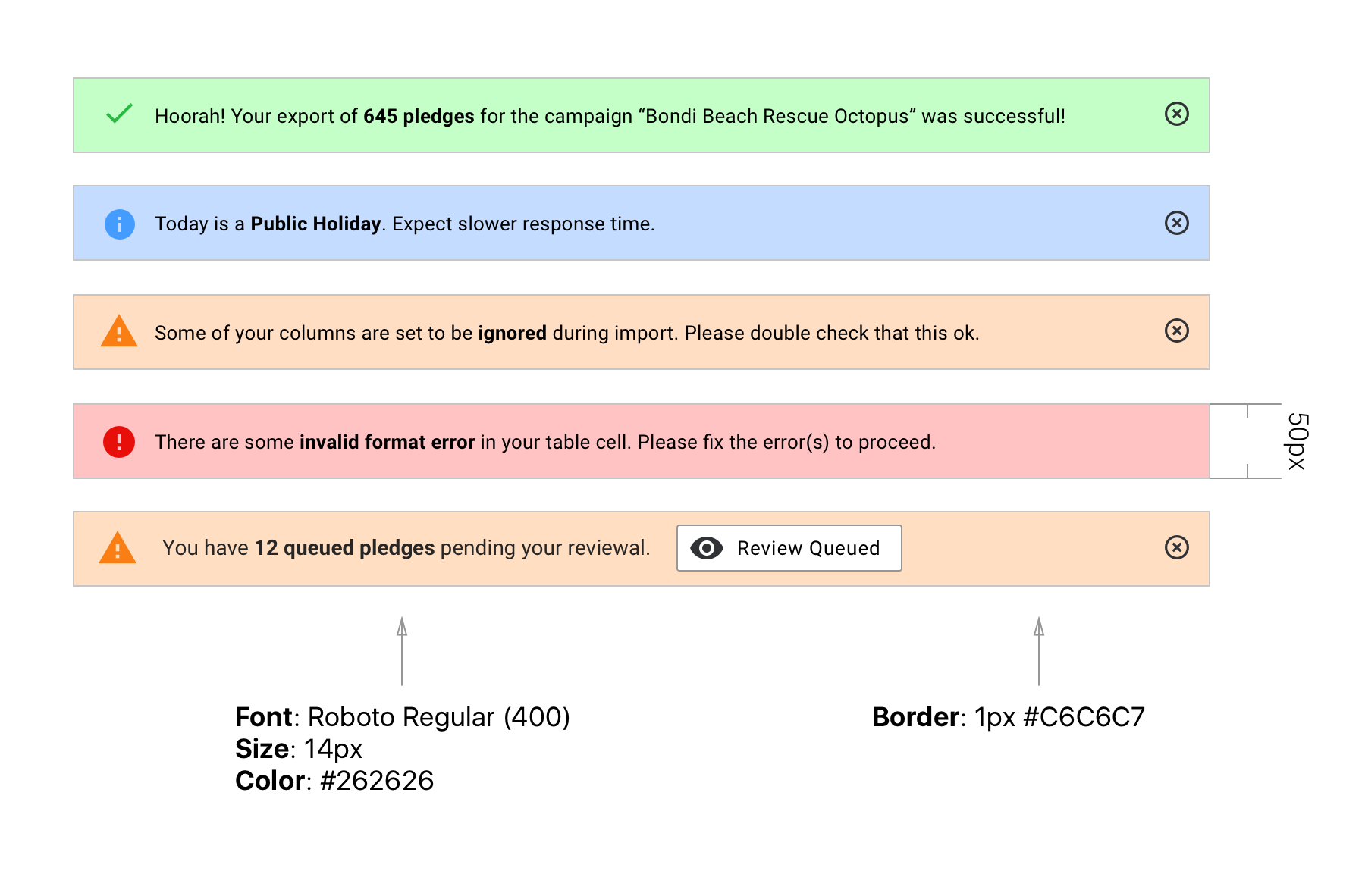
Notifications bars can be stacked on top of each other as needed as long as they are distinct levels. The level hierarchy goes as follow: Success > Alert > Warning > Info. So it is possible to see (from top to bottom) an Alert, a Warning and an Info bar stacked on top of each others. However we would avoid as much as possible to duplicate bars within one level. So we don't want to see 5 warning bars stacked on top of each others. To achieve that we should be keeping the information contained in the bar as generic as possible. So "Some of the required fields have been left empty" is preferable to "The Fist Name field has been left empty". Why do we want this I hear you ask? Well it would be pretty common to see several warnings or errors on some of our pages (due to the complexity of the pages we generally deal with) and vertical screen space is the scarcest so put simply we don't want to crowd the screen with several tabs since it would be seen as quite terrible user experience.
Alert Lightboxes
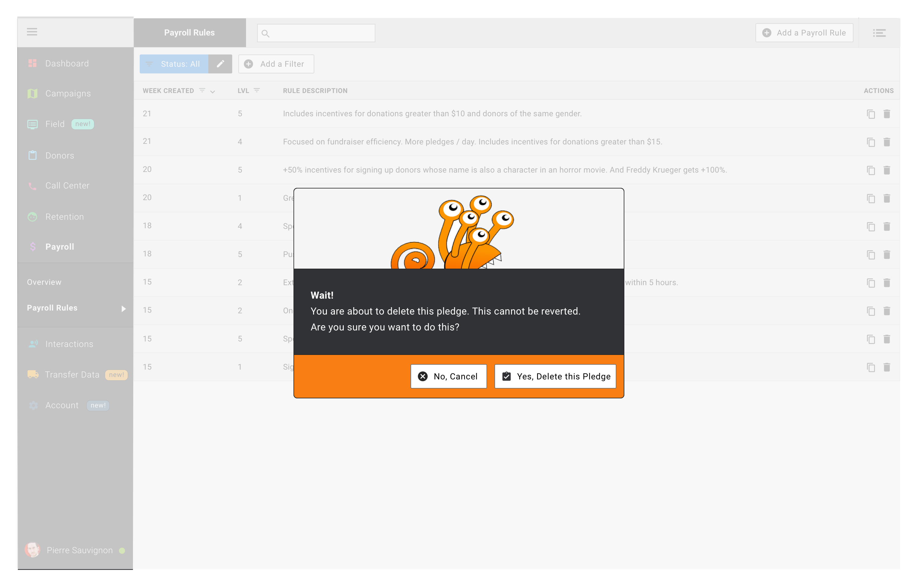
Alert lightboxes pop-up on top of the page when needed and provide our user with unmissable information and/or action steps. In my opinion this is the nuclear option when we really want to make sure that our user got the piece of information and had to acknowledge it one way or another to go on. Typically this would be useful when our user clicks on a button that triggers something important (ie. warning message following a click on a "Delete" button).
At the difference of regular lightboxes the alerts cannot be closed using the little cross symbol on the top right. The only way forward for our user is through one (or two) buttons in the bottom right part of the lightbox.
Other Elements
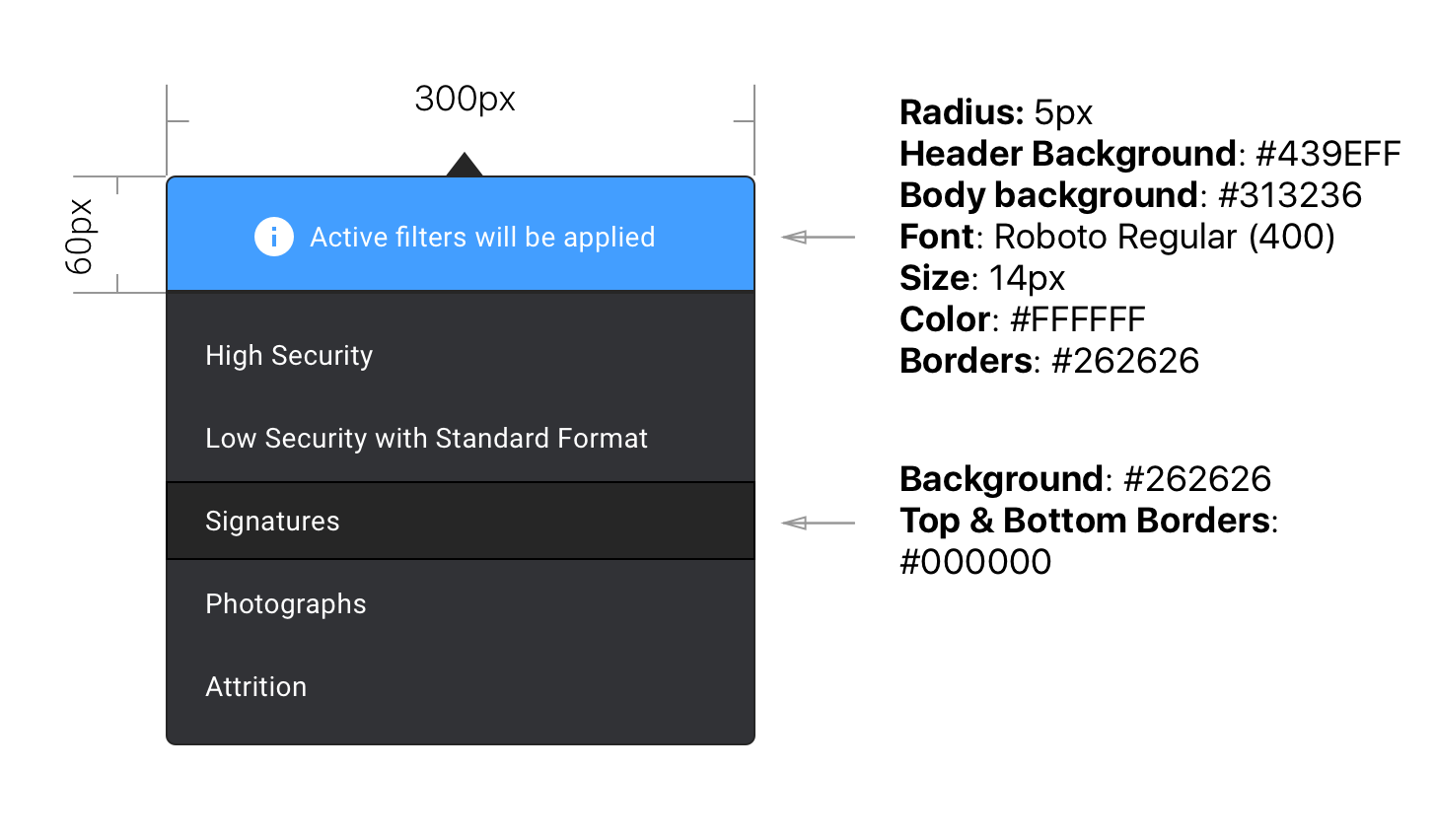
Dropdown
Note that the header part of this dropdown is using a blue background because it contains data that is associated with "information". If it was a warning it would be red, a validation it would be green etc.